Rooted in heritage.Built for what’s next.
Before drawing the first line, I started by asking questions. Then I developed a visual identity grounded in Marib’s heritage and the company’s ambitions in contracting and services.
Explore the story
I started with understanding, not with drawing.
Before developing the brand identity, I conducted a questionnaire with the business owner and explored the market around its sector. The aim was to understand the vision, the contracting industry and the context in which the identity would be used — before choosing a visual direction.
That research set the starting point for a visual approach connecting the company’s place of origin, its professional presence and its ambitions for the future.
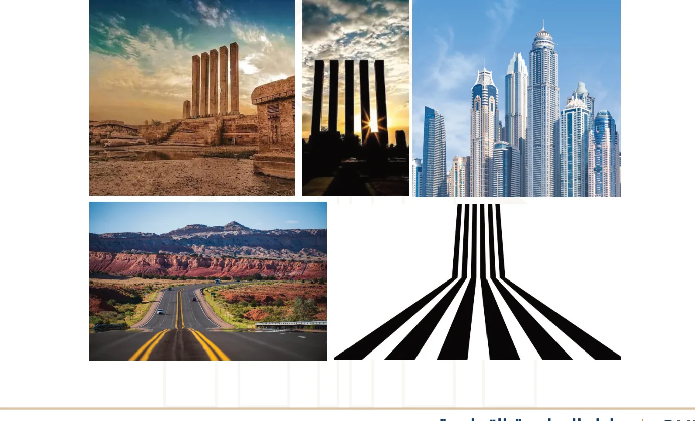
Six columns. Six explorations. One idea.
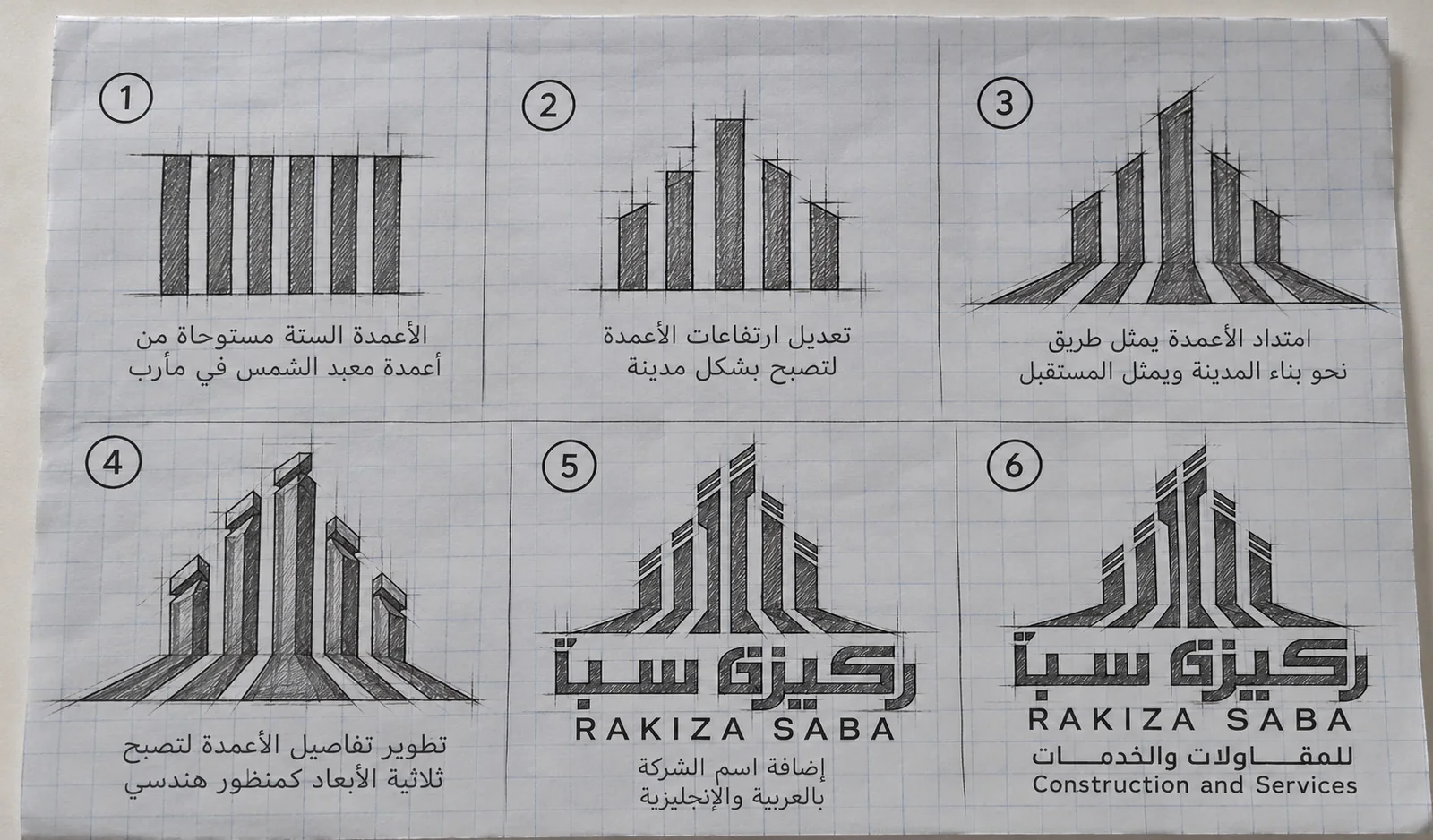
The concept begins with the six columns of Marib’s Sun Temple. Through a series of original sketches, I transformed the heritage reference into an ascending architectural form and extended its base into a road-like path toward the future.
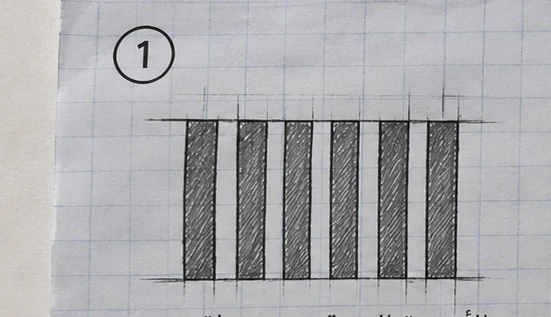 ORIGINAL SKETCHES
See all six original sketches
 HERITAGE / ARCHITECTURE / GROWTH
Deep roots. Forward momentum.
I reinterpreted a historic reference through contemporary geometry so the symbol could express reliability, construction and growth at the same time.
Roots in Marib
Inspired by the six columns of the Sun Temple in Marib.
A road forward
A wide base extending outward like a pathway.
Stability and trust
All elements rise from a shared foundation.
Modern architecture
Ascending forms that suggest a contemporary skyline.
The mark was a beginning, not the finish line.
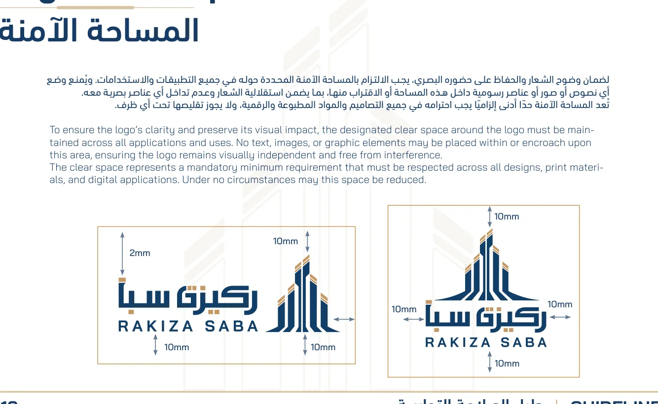
I developed a usable identity system: color, typography, clear space, patterns and approved logo variations, all built to retain a consistent character.
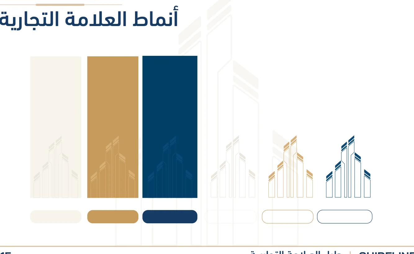
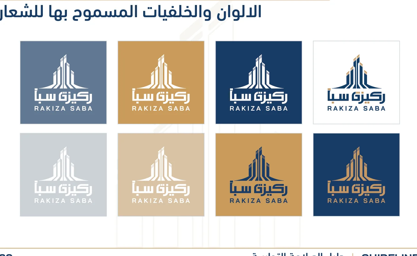
A visual idea becomes a working system.
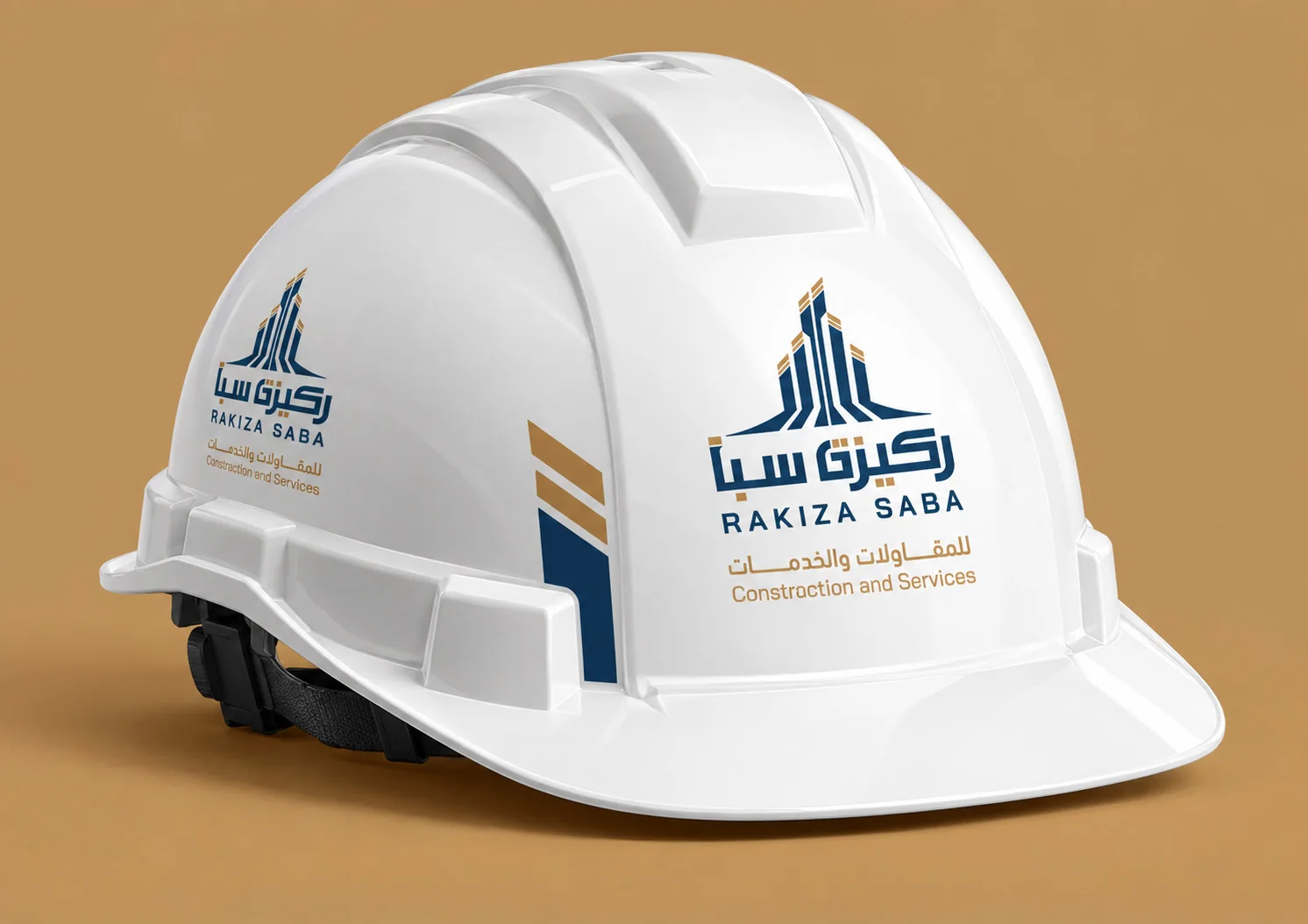
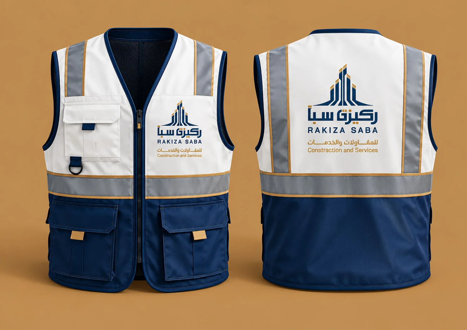
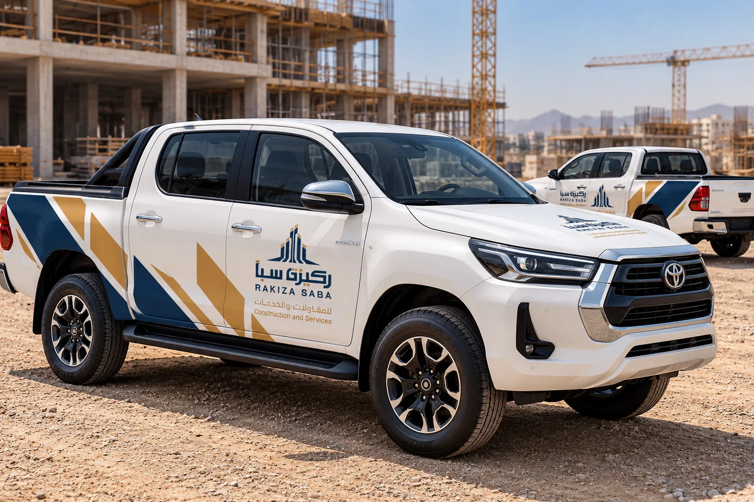
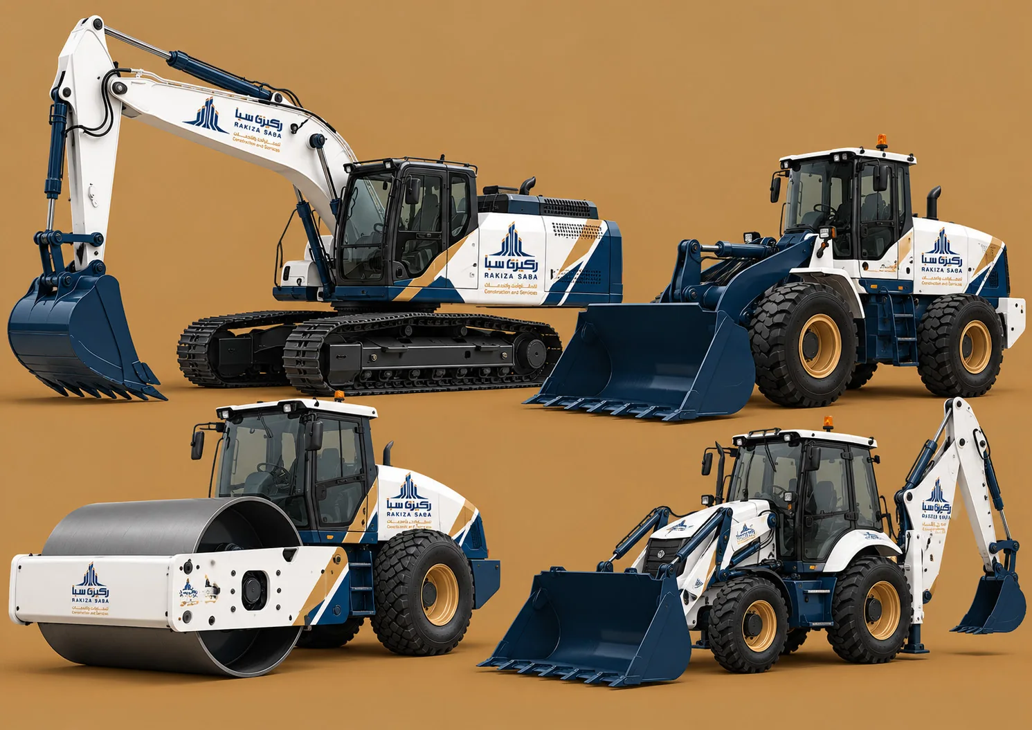
The guide includes application mockups demonstrating how the identity translates across stationery, field equipment, signage and digital channels.

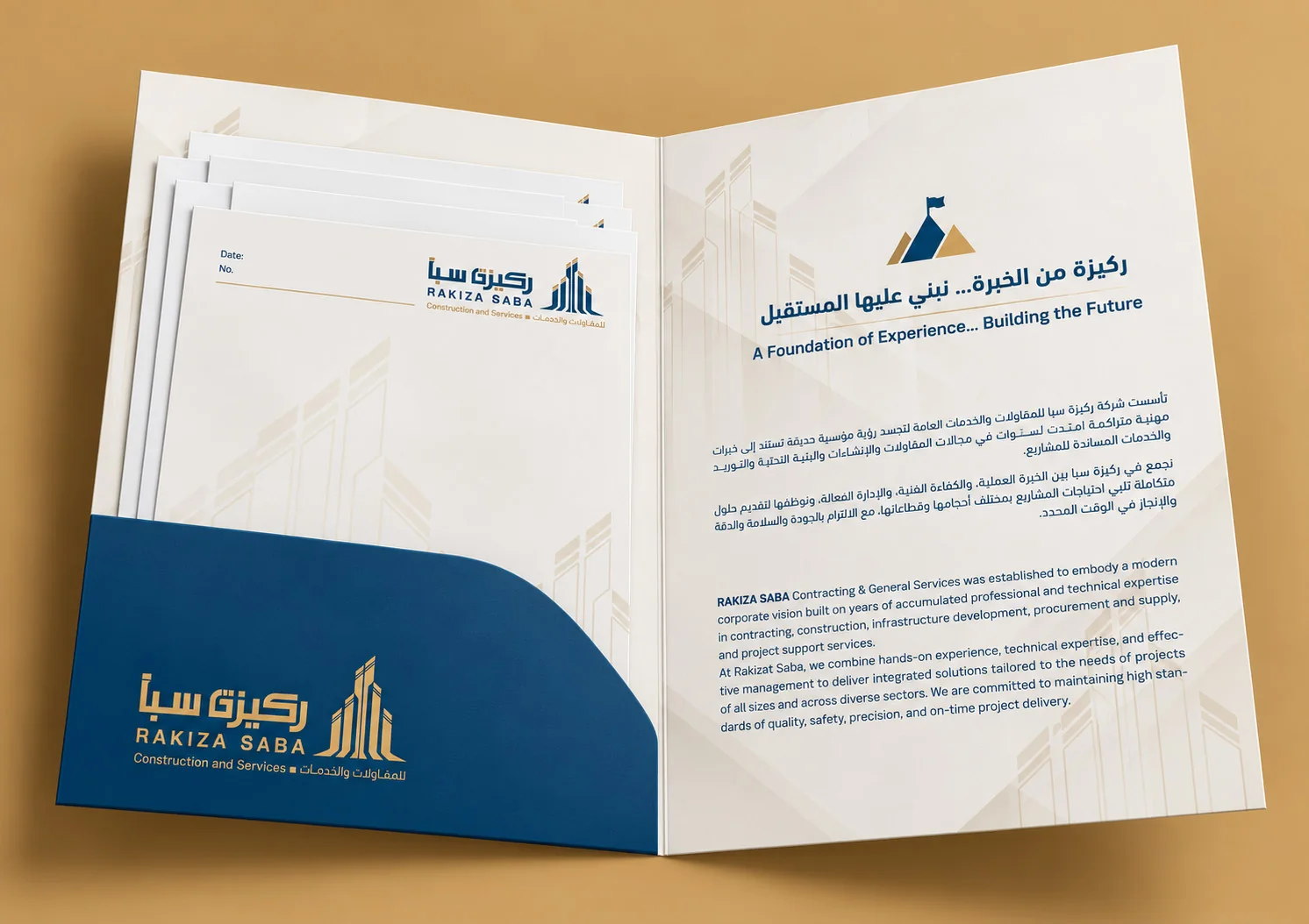
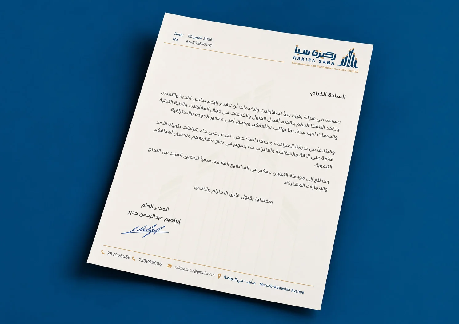
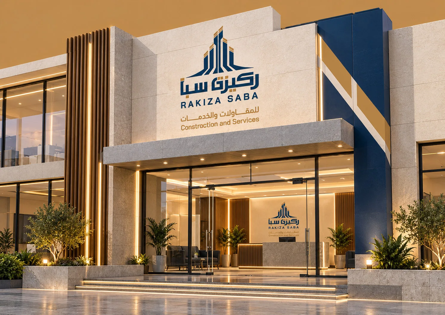
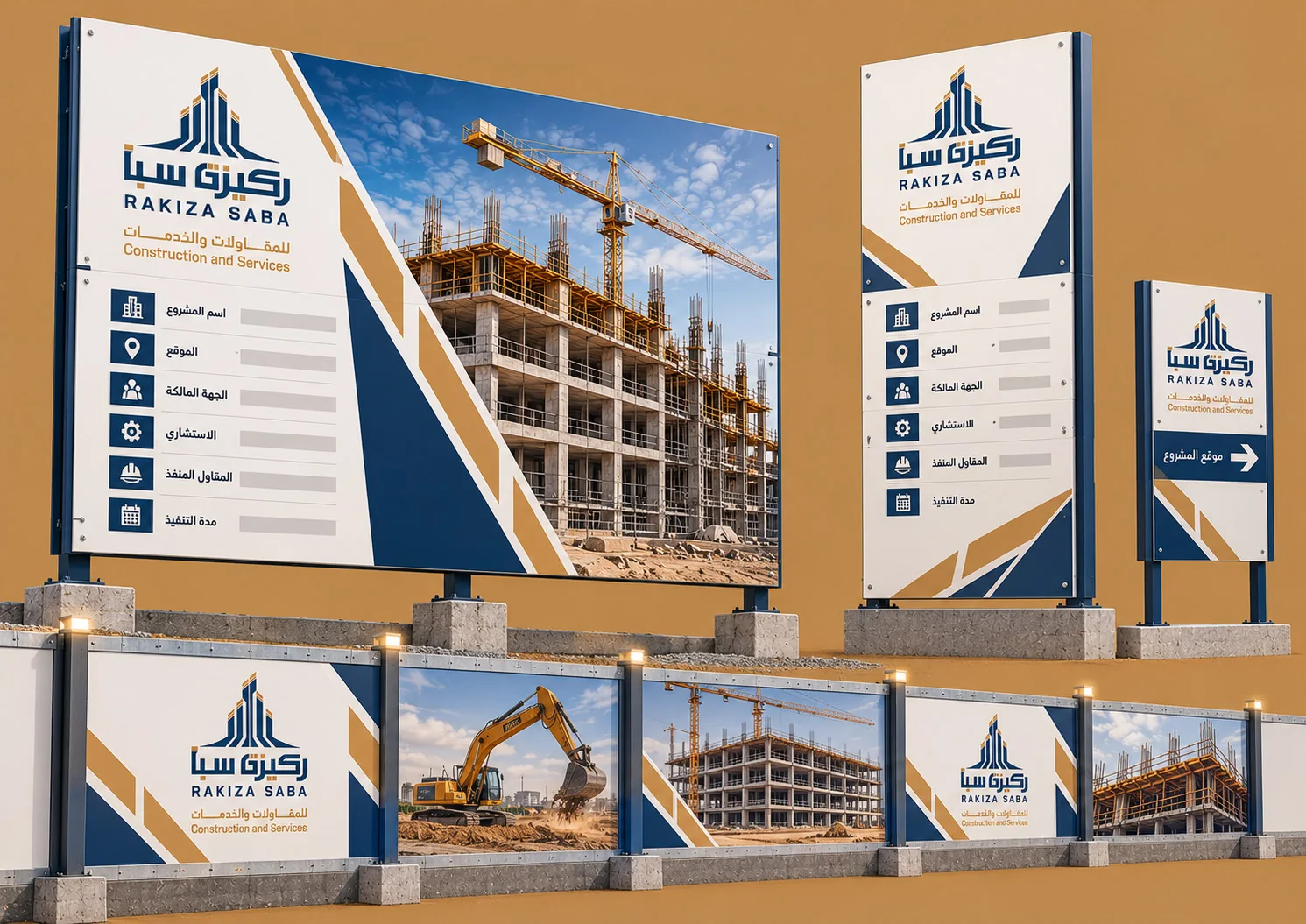
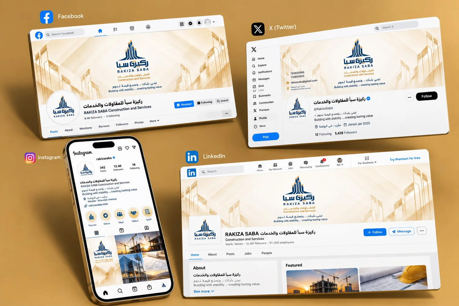
More brand applications
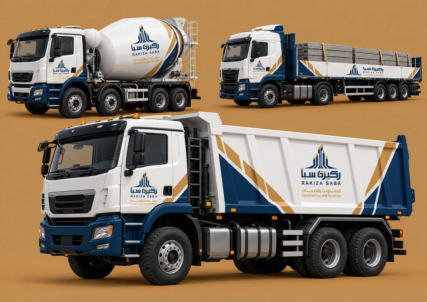
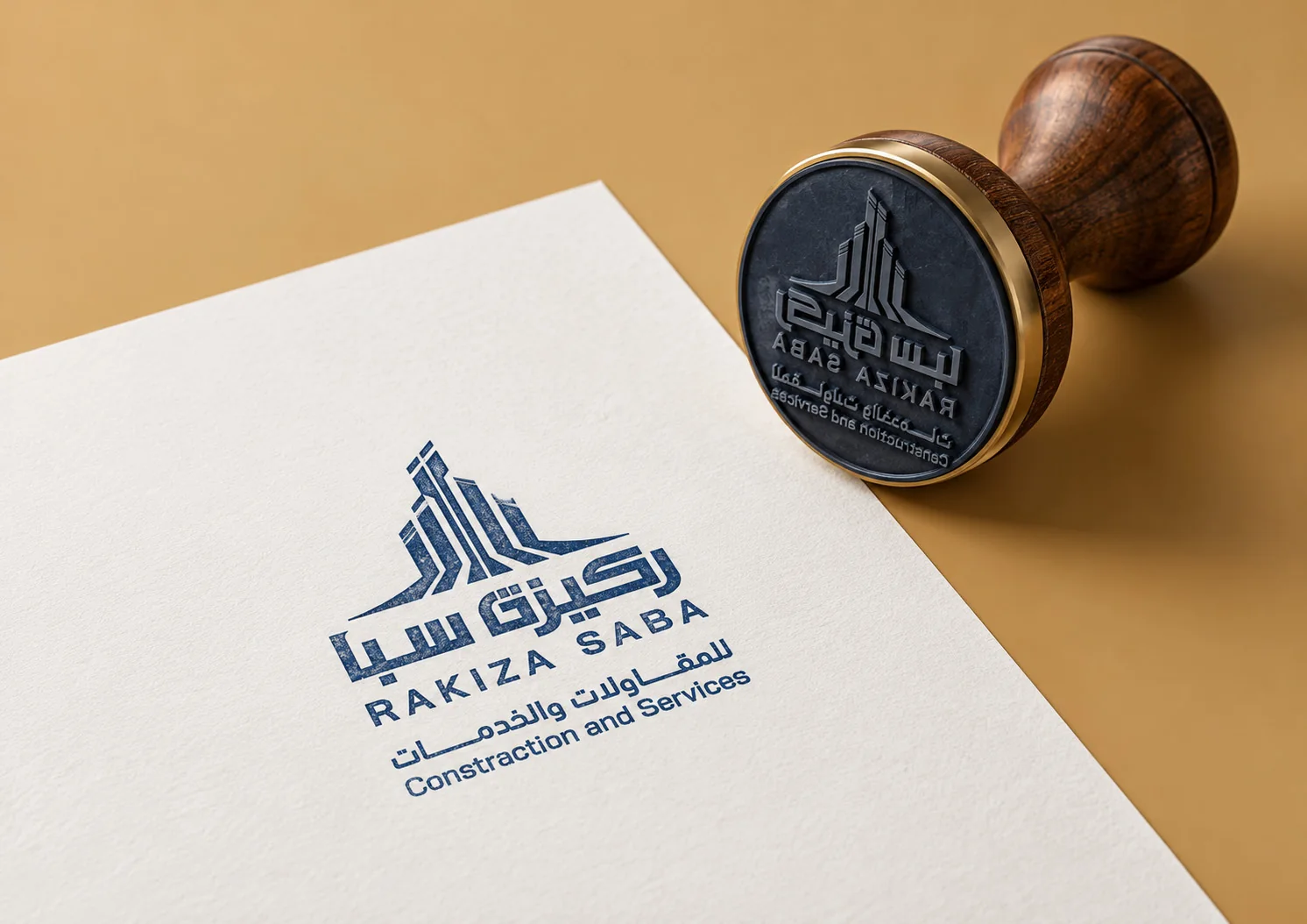
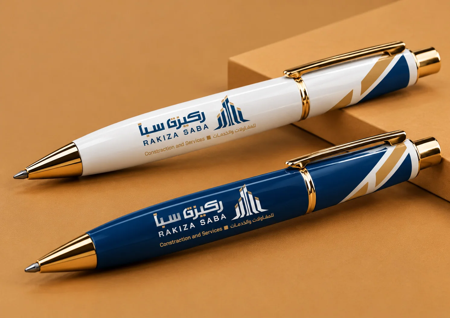
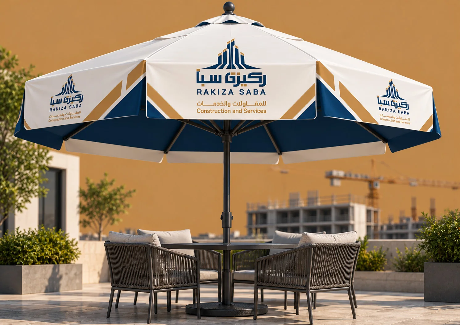
These visuals are conceptual application mockups from the brand guide; they are not evidence that every item was manufactured or installed.
A visual identity designed for consistent use.
A brand is more than its logo. I documented clear space, minimum size, approved colors, backgrounds and misuse examples to help protect the visual system across formats.
From a rooted idea to a recognizable brand.
RAKIZA SABA shows how I approach identity work: understand the business and its context first, then create a concept and a usable visual system — not just an attractive mark.