Yemen Wallet — from service icons to one cohesive message.
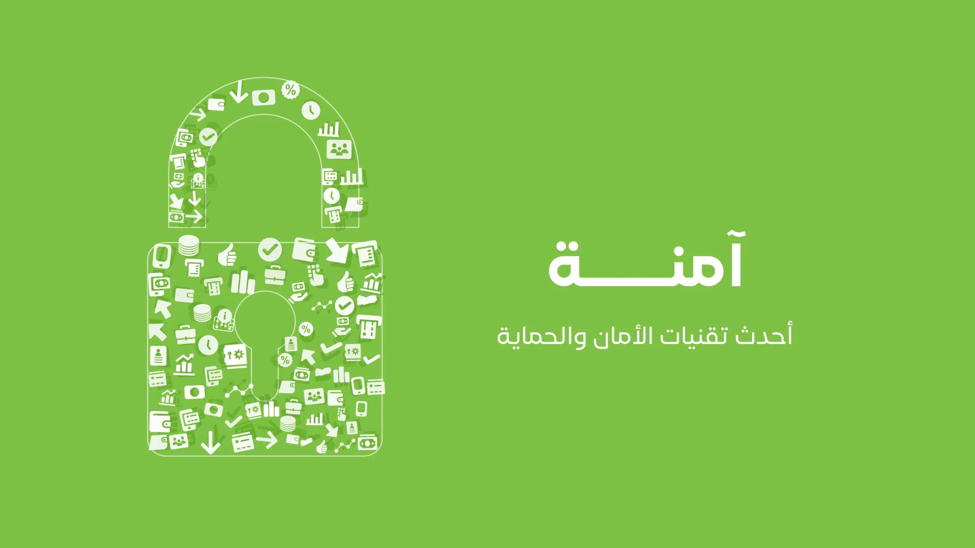
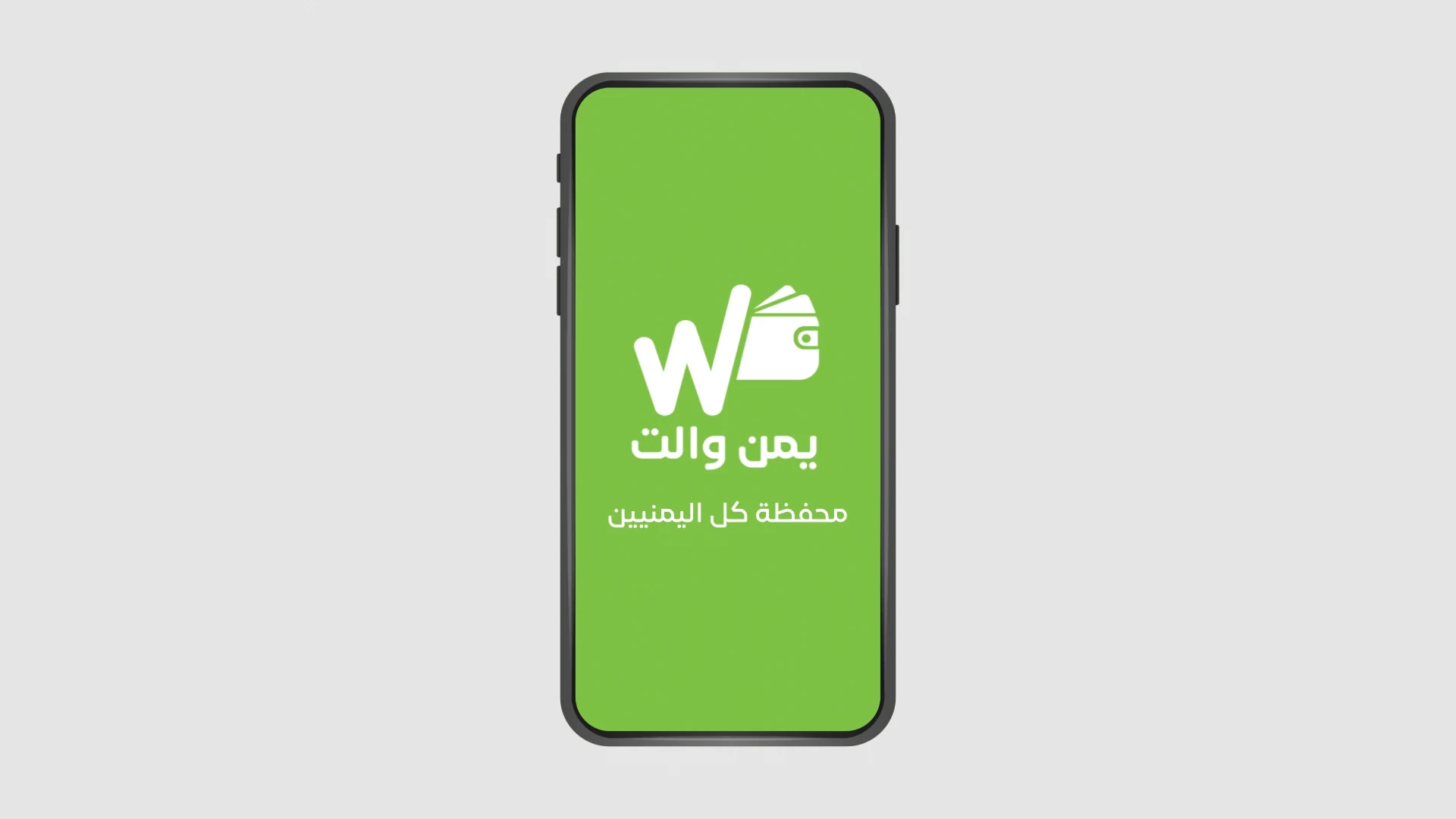
A short icon-based motion film. The same group of service symbols reshapes itself to communicate a national wallet that is secure, fast, easy to use, advanced and economical, before arriving at the Yemen Wallet identity and mobile app.
The brief is straightforward: communicate the wallet’s key attributes in a short, readable sequence. Instead of introducing a new graphic language for each message, I used the same white service icons as reusable visual material, assembling them into a new recognizable symbol for every point.
Consistent icon scale, choreographed trajectories and a fixed green-and-white palette keep the transitions legible at speed.
ClientYemen Wallet — Yemen Post wallet
Discipline2D motion / icon morphing
DurationApproximately 24 seconds
Format1920 × 1080 · 30fps
02 / SHAPE SEQUENCE
Six benefits. One motion language.
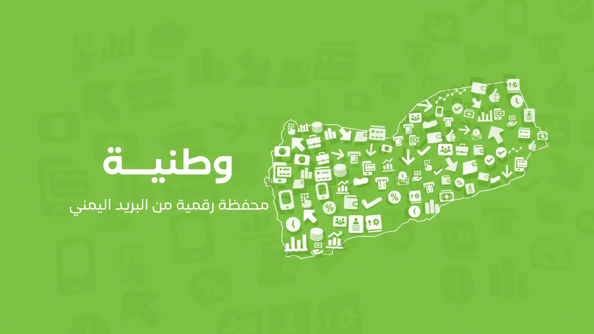
National
Service icons assemble into the map of Yemen.
03 / STORYBOARD
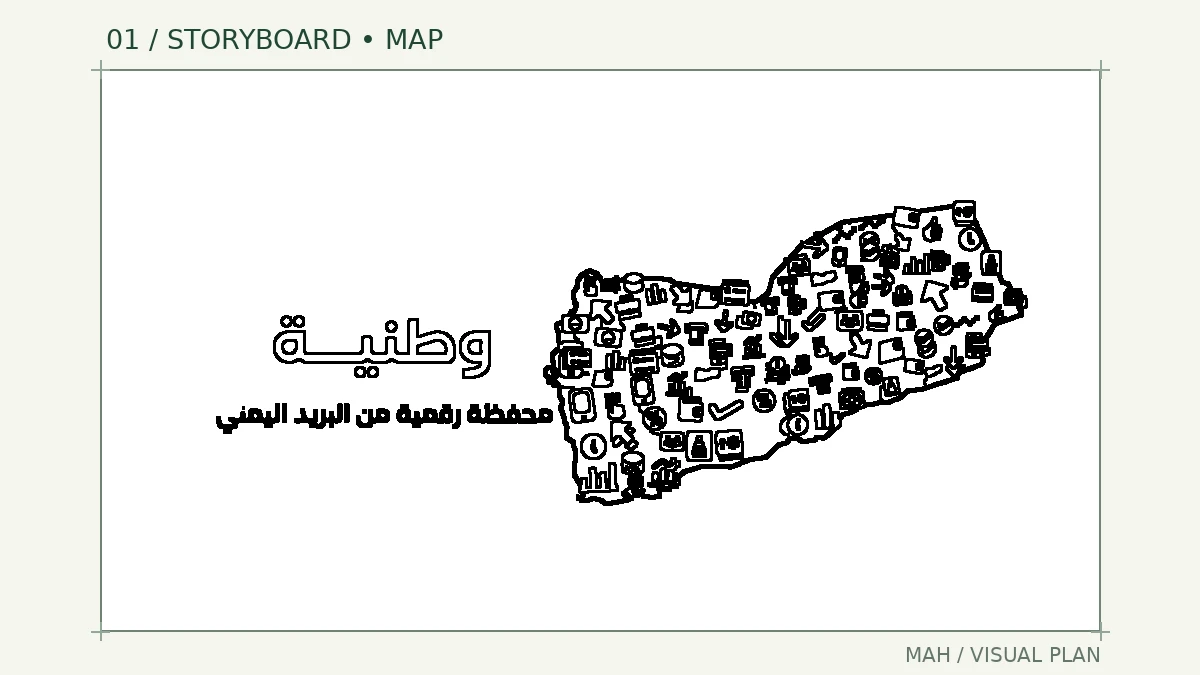
From scattered icons to a symbol.
STORYBOARD / VISUAL PLANFINISHED FRAME
04 / MOTION MOMENTS
Watch the icons transform.
Original motion excerpts, muted and free from player controls.
01 / MP4 · 16:9
From map to lock
02 / MP4 · 16:9
Arrow and hand
03 / MP4 · 16:9
Gear and percent
04 / MP4 · 16:9
From icons to identity
05 / MY ROLE
Design through final direction.
I handled the design, illustration, animation, editing and final direction. The execution centers on how icons are distributed and regrouped into successive symbols, and on pacing the transitions so the short film stays clear and light.
Visual design and illustration
Animation and shape transitions
Editing and pacing
Final direction
06 / FINAL FILM
The finished film.
The full YouTube video will appear here once a published link is supplied.
LET’S CREATE
Need to explain a service with clarity?
I can turn a product’s key benefits into a clear, memorable motion piece.
 01 / ORIGINAL MOTION